Thursday, 14 April 2011
Evaluation
The brief I had chosen was to create a music video and two ancillary texts. The ancillary texts I selected were the poster advertisement for the album and the digipak, the reason I chose to do these rather than a website design was because I had created posters and advertisements in previous tasks and I had no familiarity with website design. I will now evaluate my work in detail to show my planning, research, ideas and development. The first thing I did after choosing my brief and researching the history of music, was deciding on the genre I wanted to focus on which is pop. I felt most comfortable with this genre as I’m familiar with it and I am the typical target audience for this genre. I feel that my work has been influenced by the pop genre and I have stuck to the conventions throughout. In my video I used the conventions clearly and developed them slightly. The conventions can be seen on my blog, they were posted on Monday 15th November 2010. Pop music videos follow a rule in which a narrative combines with an exaggerated performance. I used the narrative of a boy and a girl’s relationship and memories of happy times together combined with an energetic performance from the artist. From studying narrative theories, Kate Domaille (2001) suggests that there are only 8 narrative types which can be applied to different genres, I believe that my videos narrative would be "Romeo and Juliet" which is the typical love story theme. A performance aspect often occurs in pop music videos, so I chose to use this as the main part of my music video. Conventions usually consist of close up and medium shots of the performer singing but I predominantly used medium shots as I felt that it was a great opportunity to show the performer really getting into character by using hand gestures and subtle dance movements. It also allowed me to show the artists style and outgoing attitude. I used a few close up shots in my video, for example, when the performer was sat in a chair and another in a green screen clip but I wanted to limit the close up shots of him singing because I didn’t think that they were as aesthetically effective and you couldn’t see his movements as well as in a medium shot. However, when it came to the narrative I used more close-ups, for example, when the girl has her head leant on her boyfriends shoulder I felt that a close up shot would be more relevant in order to emphasise the closeness of their relationship and to show their happy facial expressions. I also used a high and close up shot when the female performer is putting her make up on as it highlights her beauty. Pop music videos often consist of a lot of colour variation through the use of the mise-en-scene, lighting set, costume, hair and makeup. However, I wanted to keep my music video quite subtle but effective due to the song being emotive and romantic. I used black and white to edit my video and to create a separation between performance and narrative. The black and white colour scenes show the happy times that the couple have shared together; I felt that black and white sets a more romantic tone to my video due to the connotations which are romance or a previous event. For example, in Beyonce’s video for ‘Broken Hearted Girl’ the black and white connotes a romantic time in the past. I used colour and slightly changed the brightness when the artist is singing because his attitude is more cheeky and outgoing and is generally more upbeat and less romantic and soft. I used high contrast black and white when the artist sings whilst sat down because it separates from the memories but it isn’t as upbeat as the green screen clips so I felt that this effect fitted in well. Dance routines are also popular in pop music videos but it depends on the mood of the song, as my song is fairly slow and passionate I felt that a dance routine would be irrelevant, instead I just made the performance of him singing more gestural and optimistic. In most pop music videos, a happy, fun and light-hearted atmosphere usually runs throughout. I chose to use this convention by basing my video on a teenage love theme. The locations I chose to use for the romantic scenes were the foreshore to give off a peaceful beach effect and a wood where they could have fun. The reason I changed my initial storyboard idea was because I didn’t feel that an argument would fit to this convention and I didn’t feel that it should be broken because it wouldn’t really go with the tone and the lyrics of the song. I believe that by using these locations I am sticking to the conventions and a happy, sentimental atmosphere is portrayed. Costume, hair and makeup are also very important in pop music videos as it shows off the performer’s style and character. However, as my artist was male, he wore no make-up but his hair was styled and nicely presented to show that he took great interest in his image. He wore a polo shirt, black jacket and low crotch jeans during his green screen clips to show that he is a quite laid back character, which is portrayed through his casual clothing. When he is singing whilst sat in a chair, he wears a t-shirt and jeans to show he is a fashionable guy but again reinforces his cool, calm persona. The girlfriend in the video portrays a very fashionable image and shows that appearance is very important, for example, she wears a little black dress which is know as an ‘LBD’ in a celebrities world, which is a clear fashion statement and a popular evening garment. She also wears a white flowery puffball dress when she is looking at the flower lights which link to the pink rose lights which are a sign of happiness. When she is at the foreshore and in the wood, she wears a fluffy hat, purple feather earrings and stripy tights to show off her winter fashion. Appearance and image are important in music videos, for example, when I analysed my three videos on my blog, dated the 27th and 8th of October, I found that all three artists saw their appearance as being important. In Katy Perry’s video for ‘California Girls’ she wears a number of different outfits, her first one being a multicoloured mini dress which has a number of different sweets such as ice cream and smaller cakes on it, she also wears a violet wig which represents the well known sweets 'Palma violets'. Her necklace is made of delicately wrapped sweets and her high heels, headband, bracelet and ring all show that she is very feminine and girly and that she really fits in with the ideology of the 'candy' game board theme with her character being one of the 'Queens of Candyfornia'. Also, in Christina Aguilera’s video she wears leather trousers with splits going down the inside leg and she wears a short mini skirt which represents her provocative ideology. In Nelly’s video for just a dream he wears a diamond earring and a thick gold chain bracelet which also reflects his ideology of having swagger and being rich. I believe that I have used the mise-en-scene effectively to show both characters individualities. Through the process of making my music video I feel that I have used and adapted the conventions very well and I have made it significant and relevant to the genre. When it came to designing my digipak and poster advertisement I analysed three front album covers and three album poster advertisements which helped me discover conventions. From studying front covers I realised that they consist of just an image, title and the artists name only (and a parental advisory sticker if necessary). However, a back album cover consists of an image if wanted, a track list, a barcode, the record label, and production information in small print containing websites featuring the artist and copyright information. I know these conventions from analysing three CD covers, Pink Friday by Nicki Minaj, Funhouse by Pink and One of the Boys by Katy Perry. I figured that the rest of a digipak was just made up of album artwork. I wanted my digipak to relate to my video by being simple but effective. So, I wanted a plain white wall where I could take six different posed shots, however, I wanted the front cover shot to be the same as the back cover shot but from backwards facing so it created a 3d effect. The tone of my digipak is soft due to the black and white shade created, this matches with the memory shots in my video. The artist is posed as it uses the conventions of pop album covers and his laid back attitude is portrayed again by his clothing; a tracksuit top and jeans. His hair is styled to show he is fashionable and that his appearance is important. I used a bold contemporary style typeface for the artists name, ‘Danny T’ and the album title ‘Signs’ in the same style font but smaller to match the house style created. The reason that I used the name ‘Danny T’ for my artist is because it is influenced by pop artists name ‘Jessie J’. I named the album ‘Signs’ as it relates to the connotations in the music video, showing hidden signs. For my poster advertisement I chose to use the same image as the front cover of my album as it matches the overall tone of the video and the digipak. I used black and white colour scheme again as it creates the same mood of coolness and portrays the casual attitude of the artist. I took the influence for my poster advert from pop rockers ‘Greenday’ as it shows simplicity but effectiveness, although it has a different style, my advert contains an image, the artists name and ‘presents’ the album title. It also contains a small logo telling the audience the record label. The target audience for the pop music genre is very wide as it has the highest chart numbers, but the predominant target audience would be ‘tweenagers’, teenagers and young women. I believe that my video would target this audience very well as the artist is an attractive male who would attract more female 9-20 year old fans. I feel that the combination of my products overall are very effective. I think that the soft tone and the black and white colour scheme used in my video, poster and digipak works well and I feel it all matches as a whole. However, if I could improve them to work better together I would have used more creative pictures and they wouldn’t be as simplistic. I would have used more in terms of mise-en-scene and I feel that I could have used props as connotations to make more of the album title ‘Signs’. Apart from that, the simplicity still creates a good effect that reinforces my video. This task has introduced me to new media technologies, such as, ‘Adobe Premier’, ‘Adobe Photoshop’ and digital video camcorders. When it came to recording my video, I wasn’t familiar with using a digital camera and a tripod. On my first filming session I went to Hessle Foreshore, I tried out a few test shots first so that I became more confident using the camera. The first shot I took was a medium shot whilst the actors were walking towards me, I set up the tripod to the highest it would go and I pressed play on the camera. I believe that this shot was fairly good and it was used and edited into my final music video. The second shot I took was a low angled close up of the pair, I positioned myself on a rock so that I could get above them, I then pressed play on the camera to create a handheld shot, which again went well so I felt more confident using the camera. I tried to do a pan shot of the Humber Bridge using the camera and tripod. I positioned myself at the back of the foreshore and I held the tripod and turned it slowly, I couldn’t use this shot in my video because it was very jerky and it was supposed to be a still and peaceful shot, however, when it came to using a background behind the green screen footage, I still framed the shot and the used the sunset as the background. I feel far more experienced using a camera now and I feel that if I created a music video again I would do it a lot faster and I would know how to do more techniques such as zooming in and out and creating a good handheld camera shot without it looking rushed and messy. When it came to using the editing suite during the editing process, I didn’t feel confident at all. I had used an editing suite once at the beginning of the A2 year and I had very little experience. The first thing I learnt on Adobe Premier was how to upload footage by plugging the camera into the computer, I then had to rename each individual clip by double clicking on the text, this was all I did for my first editing session as I had a lot more footage to shoot. When it came to uploading my next lot of footage, I worked out how to put shots together by dragging the clip I wanted and dropping into the main area. In order to put clips together I just dragged and dropped them next to each other and it immediately cuts material together. When I uploaded green room material onto Adobe Premier I was unsure what background to use so I played around with coloured backgrounds. I did this by going on video effects and chromo key, I then dropped it onto the clip I wanted and clicked on custom which allowed me to choose any colour which would be dropped onto the clip again. I tried using a plain white background but it still looked bland, as did blue and red. Therefore, I looked through my clips and found a pan movement of the Humber Bridge and the sunset across the foreshore so I still framed the sunset and using the same technique as I did for the colours I set it as the background. The background worked well with the artist so I’m glad that I took the time to play around with different styles. I also learnt how to change my footage into black and white for the memory scenes. I went onto video effects, matrox colour corrections and dropped it onto the clip I needed. I then clicked on set up, black and white effect and by pressing custom it allowed me to change the brightness, colour and contrast using dials. I also used this technique to create high contrast black and white clips. The reason I used high contrast black and white clips was to separate them from the black and white and colour clips but also to connote an artist style to match the digipak. I chose to use continuity editing in my music video because I felt that it went well with the narrative and the pace of the song. I also used fades in my music video and I figured this was easy to do by simply clicking on video transitions, cross dissolve then dropping it onto the chosen clip. I managed to use fades very confidently throughout the process. Lip syncing was the main problem during the editing process as it took a few attempts to get it right. I played the video with sound and matched it to the sound from the track and kept cutting the clip until it looked correct. Once I got used to Adobe Premier I enjoyed my experience using it, although it was tough. Photoshop was also something I had never used in previous tasks. Even in the AS year, I used Microsoft Picture Editor to change the brightness and the contrast. I opened up my front cover on Adobe Photoshop and resized it to make a CD cover. I then changed the image to black and white and edited it by changing the brightness colour and contrast to get the effect I wanted. The effect I wanted was to match the tones and the mood with my video but by also adding a contemporary art effect with the use of swirl patterns. The poses the artist did also gave him the ideology of having lots of swagger and being really cool. I then opened the text onto Photoshop and made the edges transparent so there were no white edges. I used the same technique for every image on my digipak. For my poster, I used the lasso tool to cut out the artist and place him on my background. I also re-sized the image to 350 so that he fitted in with the background better. My experience on Photoshop was positive because I had no experience what so ever and I would definitely feel more confident using it again. At the beginning of the year I thought that working as a team would have a positive effect on making my music video but when I actually worked in my team it proved to be quite difficult. Tasks were allocated evenly between us, all of our storyboarding, recording and editing was done together but other things such as analysis of lyrics and analysis of other media texts was done quite separately. I only worked as a team in order to create my video. I realised that working in a team had a few strengths and a few weaknesses. One strength about working in a team would be that you have double the ideas and double the creativity which appeared to be positive because we had a lot of ideas when it came to recording and editing. Another strength would have been if you were struggling with something you always had somebody there to ask which I found useful and a good way of getting support. However, we soon had problems. One of the problems we had was agreeing on ideas and how effective we thought they would look but we managed to put our ideas together evenly and decide on one which consisted of both. I also found it harder to organise events to film the video and to edit it as my partner wasn’t always available when I was which proved to be a problem but we created a time plan where we agreed on one hour a week when we would both be available. Another problem I working in a pair is that one person could become more dependant on the other, although this wasn’t evident in my group. However, if I were to do this task again I wouldn’t work in a pair or a group as I think that it consists of too much organisation when work could be taking place, If I did It on my own I would of achieved my aims earlier as I was available more often. At the beginning of my video I have done a medium shot of the artist sat in a chair with an ipod, he puts the headphones on which signals that the song has started. I used high contrast black and white for this shot because it makes the video look modern which reflects his style. It also separates from the colour green screen clips and the memories. The next shot shows the artist carrying his girlfriend; this shot is a memory from the past which is indicated by the black and white. Black and white also creates a romantic and a relaxed atmosphere. The location is at Hessle foreshore which looks very beach like, and a beach is seen to be a peaceful place in music videos, such as Beyonces video for ‘Broken Hearted Girl’. The artist is wearing a black jacket and jeans which creates a casual look and the female wears a furry hat, a woolly cardigan, patterned tights and high heeled shoes which shows off her winter fashion. The mise-en-scene in these shots suggests romance and attachment. The shot of the couple sat at a dinner table is also a memory of a previous happy event. The mise-en-scene in this image shows contemporary art wallpaper which matches the digipak. The female actress is wearing a short black dress, a stylish bracelet and heavy makeup which shows that she has made an effort to look good for a meal with her boyfriend. The artist wears a checked shirt to show that he has also made an effort to look stylish, the couple hold hands indicating the strength of their relationship. This shot was edited into slow motion to emphasise their hands meeting. The green screen clips all share the same background of the foreshore at sunset. These shots are in colour to reflect his upbeat performance as well as showing the separation between the black and white memories. Also, the fact that it is in colour emphasises the sunset which is seen as an icon of romance. The cinematography shows that this is medium shot, the reason I wanted it to be a medium shot was so that it highlighted his dance movements and showed off his performance skills. The artist wears a polo shirt, black jacket and jeans to reinforce his cool fashion and persona. The shots shown of the female actress getting ready in the mirror tells the audience that her appearance is important in her relationship. In terms of cinematography I used a medium shot when she spins around in the mirror to show her fashionable outfit, and I used an over the shoulder shot when she is doing her hair so that she could be seen more clearly in the mirror. The reason I chose to do medium shots of the female actress of looking and performing in front of pink rose fairy lights was to show her girliness and happiness. A pink rose has a connotation of happiness and I felt that it would symbolise her girly interests. She is wearing a flower puffball dress with a flower in her hair which reinforces the theme. I used hand held camera movement in some of these scenes as it worked well with the lights and it suggests that she is crazy in love with this boy due to the unbalanced and delirious camera movement. When the actors have a leaf fight near the woods, they wear the same costume as they did in the ‘beach’ scene which sustains their fashion. This scene is very flirtatious and shows that the couple have a lot of fun in their relationship. The car shown in the back of the medium long shot is their car, the reason you can see only one car suggests that the couple are isolated from the rest of the world, they are very in love. The medium close up of the female with the leaves falling on her is one element of their play fight, we slowed it down to make it look more effective and it also shows her facial expressions very well. The medium shot of the girl actress walking and looking back at the camera suggests that it is a home video which the boyfriend had taken as she looks very flirty and happy, it also reflects them lyrics of the song when it says “and when you smile” which shows an example of imagery. When the couple are sat on a rock throwing stones into the sea, this shows that they often have fun and find many activities to do as a couple. The high angle shot of the girl putting lipstick on starts the sequence of her getting ready, this sequence shows the effort she puts in to making herself look good in her relationship. The close ups of her doing her make up and hair also emphasises her beauty. We used fades in the video as they are a very peaceful transition and it matched the pace of the music. The handheld camera footage of Sarah and her dog is meant to be from a home video which the artist had previously taken, imagery is also created in this clip as when she smiles up at the camera, the lyrics repeat ‘’And when you smile’’. Slow motion was used at the end of the video when Danny chases Sarah through the woods, this creates a romantic effect and emphasises the fun they are having. The end shot used in my video is a medium shot of the artist, he shrugs his shoulder and throws his hand as if to say ‘That’s it’, he is also laughing to show that he is not a serious character and I feel that this shot adds humour to my video. My digipak follows the same theme as my video with the use of black and white. The background used on my front cover was taken in New York City which is a very busy and glamorous place, it reflects his lifestyle. The blurred taxi in the background is iconic of New York and it emphasises the quick pace at which everything travels there. I placed the image of the artist in the middle of the buildings and I made him as tall as them to show that he is the main image and that he is the dominant character. I chose to edit this image to black and white which matches the video; however the blue tone adds a cool vibrant atmosphere to match his cool attitude. The font used for the artists name ‘Danny T’ is very bold and artistic, similar to the font style used for the album title ‘Signs’. The reason the album is called ‘Signs’ is because the music video has hidden signs, for example, the memories are portrayed in black and white, the font also looks like an old cinema sign style font. The artist wears a sports jacket, a polo shirt and jeans which show off his casual style. Also, he is posed very casually to reinforce the relaxed theme. The three panels of my digipak contain three differently posed images against a plain white background. The reason I wanted him on a plain white background was so that he looked like he was doing a photo shoot, this is reinforced because he is wearing the same clothing. I added some contemporary art to these images to show that he is a unique artist. Again, I used black and white with blue tones in these images to show his cool attitude. The back cover is the same image as the front cover but from behind. The reason I have chosen to do this is so that it is obvious that the front cover image looks like a backdrop. This connotes that even though he has a glamorous lifestyle, it is not his main interest, and from the back it shows that he is just an ordinary guy who happens to have a great talent. I used the same font as the album title for track list as it sets a house style. I also did each track a different size so that it looked quirky and fun as well as representing an old style cinema font. Underneath are the websites where he is featured, which is a way of promotion. It also contains a barcode which is a main convention alongside copyright information. The spine I designed is black with the title of the album and the artists name in the same fonts used on my front cover, supporting the house style. The reason I chose to do the spine black was because black is the predominant colour used in the colour scheme of black and white. I then designed a logo for my record label and placed it at the bottom of the spine. The institution is called ‘Reem Records’ and the logo I created has ‘Reem Records Ltd.’ In red with two black arrows around it, I chose to make it red so that it stood out and promoted the record label. I also made a CD design which is all black with ‘Danny T’ at the top, which looks simple but effective. The poster advert I made is the same image as my front cover, it has the same connotations. However, I added a positive quote from ‘The Guardian’ newspapers with a star rating in order to promote the album further. In order to receive some useful audience feedback I created a questionnaire and a poll on my blog. After asking an A2 media class to fill in my questionnaire, I feel that overall I have created a successful media product. Question one of my questionnaire was ‘On a scale from one to five, how convincing is my music video as a real media text?’ and 30% of students gave it a 5, 50% gave it a 4 and 20% gave it a 3. This tells me that the majority of students thought that my video was as convincing as a real media text. A score of 3 is average, but only 20% gave it this score so I was pleased with the results for this question as it proved my music video to be fairly convincing. Question two of the questionnaire was ‘How effective did you find the performance aspect of the video?’ 40% of students gave it a 5, 30% gave it a 4 and 30% gave it a 3. I believe that the performance aspect was probably the strongest but according to these results but according to these results, a few students found it mediocre. I thought that this was quite an unfair result as the actors put a lot of effort into the performance, however, the students would have been honest and if I did the music video again I would make sure that the performance aspect would be improved. Question three was ‘How well do you feel the green screen clips worked with the rest of the video?’ 50% gave it a 5, 20% gave it a 4, 20% gave it a 3 and 10% gave it a 2. This result was one of the weakest out of any of the other questions; therefore if I could do the music video again I would definitely improve the green screen clips. I felt that the background worked well with the rest of the video, but, agreeing with 10% of students, it could be improved. There could have been a number of different backgrounds to make the video slightly more interesting and aesthetically pleasing. On the other hand, I am pleased with the results of this question as 70% of students gave it a 5 or a 4. Question 4 of my questionnaire was ‘How effective did you find the editing?’ and 40% of the class gave it a 5, 40% gave it a 4 and 20% of the class gave it a 3, so again, the results were fairly good for this question. The editing in my video mainly consisted of fades, chromo keying, slow motion and changing the colour, contrast and brightness. I imagine that the 20% of students that found the editing average would probably have wanted to see more effects and variation; this is one of the things I would change if I were to improve it. Question five was ‘How effective is the video, magazine advert and digipak all together?’ 10% gave it a score of 5, 30% gave it a 4 and 60% gave it a 3, so overall the results for this question showed that it was pretty average. These were the weakest set of results from the questionnaire and I do feel that my video, magazine advert and digipak could have been linked together more. The black and white tones I felt created the same mood but the majority felt that they didn’t match greatly. So if I had the opportunity to do this task again I would definitely change my digipak and poster to appear more relevant to my video. Question six was ‘Do you think the video and song worked well together?’. The results for this question were the strongest with 60% of students scoring it a 5, 30% scoring a 4 and 10% giving it a 3. I felt more confident asking this question to the students because I felt that the pace and the tone of the song went well with the pace and the tone of the video, so I was pleased with these results. At the bottom of the questionnaire I asked for ‘any additional comments’ and only three people wrote. The first comment said ‘lip syncing could have been timed a bit better’. I believe that this is true because there is one section of my video which could have been slightly more synced to the music, but I tried my best and I believe that I still created a successful media product. The second comment said ‘An effective music video! Instantly attracted both visually and audibly and its effectiveness can be gauged by the fact that you can still remember it so clearly, long after it’s ended. A truly professional piece of work.’ This comment tells me that my media products are a success and it pleases me that such impact can be made by my work. The final comment read ‘I could have easily mistaken this video for a professional music video’ which again shows me that I have created a successful media product. I found this way of gathering audience feedback very effective as I didn’t know the class who answered my questionnaire, therefore all questions were answered with honesty and according to my results I believe I have created a successful media product. I also created a poll on my blog for audience feedback. I asked three questions about my video and two questions on music and pop artists. The first question asked ‘Would you watch my video again?’ 100% of people who voted said yes, which was very positive. The second question asked ‘Do you think the performance is convincing?’ and again 100% voted yes, which made me think that the people who voted on my blog found the video interesting and effective. The third question I asked was based on the target audience which was ‘What target audience do you think my video is predominantly aimed at?’ The options were male teenagers which got 0%, male students which again got 0%, female teenagers which got 62% and female students which got 50%, this poll result was very accurate and I felt that the audience really understood my video as female teenagers and female students were my main target audience. This result was a very positive one. The fourth question asked ‘What is your favourite music genre?’ and the options consisted of pop which got 30%, rap which got 10%, R’n’B which 40%, rock which got 0% and dub step and indie both got 10% each. This result proved that people’s styles and favourite genres were very varied. However, I think that it was a good idea to choose pop as my genre as it is a popular choice 30% of the vote. The last question was ‘Who is your favourite pop artist?’ and the choices were Riana which achieved 22%, Katy Perry which got 33%, Bruno Mars who got 11%, Cheryl Cole with 33% and Chris Brown who scored 11%. This poll showed that there is a variety of people and opinions who took part in my poll and unfortunately Bruno Mars only scored 11% as favourite but overall, I feel that my audience feedback has been predominantly positive and I believe that it has proved my media products to be very successful. The general feedback received in this process was positive. In conclusion, I feel I have made an effective media product which has been reinforced by audience feedback, and by researching, planning and analysing other texts it has helped me a lot. My music video clearly represents the artist and his ideology. I also believe that it would target my audience of teenagers and young adults but if I were to recreate a music video I would use my time management skills more effectively and I would take a wider range of camera shots.
Tuesday, 12 April 2011
Audience feedback Results

This is how I worked out each percentage from my questionnaire.
After asking an A2 media class to fill in my questionnaire, I feel that overall I have created a successful media product. Question one of my questionnaire was ‘On a scale from one to five, how convincing is my music video as a real media text?’ and 30% of students gave it a 5, 50% gave it a 4 and 20% gave it a 3. This tells me that the majority of students thought that my video was as convincing as a real media text. A score of 3 is average, but only 20% gave it this score so I was pleased with the results for this question as it proved my music video to be fairly convincing. Question two of the questionnaire was ‘How effective did you find the performance aspect of the video?’ 40% of students gave it a 5, 30% gave it a 4 and 30% gave it a 3. I believe that the performance aspect was probably the strongest but according to these results but according to these results, a few students found it mediocre. I thought that this was quite an unfair result as the actors put a lot of effort into the performance, however, the students would have been honest and if I did the music video again I would make sure that the performance aspect would be improved. Question three was ‘How well do you feel the green screen clips worked with the rest of the video?’ 50% gave it a 5, 20% gave it a 4, 20% gave it a 3 and 10% gave it a 2. This result was one of the weakest out of any of the other questions; therefore if I could do the music video again I would definitely improve the green screen clips. I felt that the background worked well with the rest of the video, but, agreeing with 10% of students, it could be improved. There could have been a number of different backgrounds to make the video slightly more interesting and aesthetically pleasing. On the other hand, I am pleased with the results of this question as 70% of students gave it a 5 or a 4. Question 4 of my questionnaire was ‘How effective did you find the editing?’ and 40% of the class gave it a 5, 40% gave it a 4 and 20% of the class gave it a 3, so again, the results were fairly good for this question. The editing in my video mainly consisted of fades, chromo keying, slow motion and changing the colour, contrast and brightness. I imagine that the 20% of students that found the editing average would probably have wanted to see more effects and variation; this is one of the things I would change if I were to improve it. Question five was ‘How effective is the video, magazine advert and digipak all together?’ 10% gave it a score of 5, 30% gave it a 4 and 60% gave it a 3, so overall the results for this question showed that it was pretty average. These were the weakest set of results from the questionnaire and I do feel that my video, magazine advert and digipak could have been linked together more. The black and white tones I felt created the same mood but the majority felt that they didn’t match greatly. So if I had the opportunity to do this task again I would definitely change my digipak and poster to appear more relevant to my video. Question six was ‘Do you think the video and song worked well together?’. The results for this question were the strongest with 60% of students scoring it a 5, 30% scoring a 4 and 10% giving it a 3. I felt more confident asking this question to the students because I felt that the pace and the tone of the song went well with the pace and the tone of the video, so I was pleased with these results. At the bottom of the questionnaire I asked for ‘any additional comments’ and only three people wrote. The first comment said ‘lip syncing could have been timed a bit better’. I believe that this is true because there is one section of my video which could have been slightly more synced to the music, but I tried my best and I believe that I still created a successful media product. The second comment said ‘An effective music video! Instantly attracted both visually and audibly and its effectiveness can be gauged by the fact that you can still remember it so clearly long after it’s ended. A truly professional piece of work.’ This comment tells me that my media products are a success and it pleases me that such impact can be made by my work. The final comment read ‘I could have easily mistaken this video for a professional music video’ which again shows me that I have created a successful media product. I found this way of gathering audience feedback very effective as I didn’t know the class who answered my questionnaire, therefore all questions were answered with honesty and according to my results I believe I have created a successful media product.
Thursday, 7 April 2011
Audience Feedback Questionnaire
This is the audience feeback questionnaire which I have created. I am going to give the questionnaire to a media class, family, and close friends so that I will receive a variety of feedback which is honest and truthful. Once I have the results this will help me write my evalua tion.
tion.
 tion.
tion.
Tuesday, 5 April 2011
My front cover featured on itunes and an ipod
 This is what my album cover would look like on an ipod.
  This is what my album cover would look like on itunes.
Sunday, 3 April 2011
The digipak I made


Sunday, 27 March 2011


Saturday, 26 March 2011
My poster advertisement
This is what my poster advert would look like in an actual magazine. I think it looks very effective. 


Wednesday, 23 March 2011

Monday, 21 March 2011
Digipak
 This is my front cover, back cover, spine and extra panels for my digipak. I decided to create one extra image just in case one of the images didn't look right on the digpak I am going to create. I am pleased with these images.


Sunday, 20 March 2011
Contemporary art designs
I have been looking at some swirly contemporary art designs just to add an artistic style to my digipak. I'm not sure which one I will use for the final peice but I definately think it will make it look more realistic.


Saturday, 19 March 2011
Final font choices

I have chosen to use this font as my final choice for my digipak and poster. I feel that it is very bold and it stands out, and it sets a house style for my products.

I have used this font for the album title and the tracklist, I think that it reflects the title 'signs' very well and it also reinforces the house style.
Wednesday, 16 March 2011
Monday, 7 March 2011

Friday, 4 March 2011

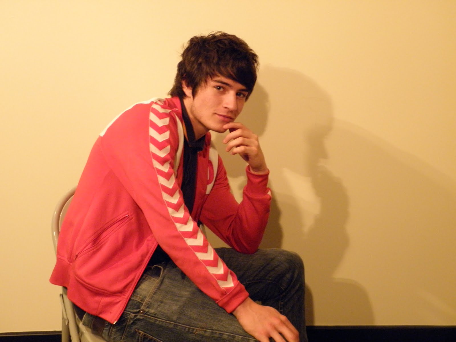
Test shot pictures for Digipak
These are the shots which I have taken for my Digipak. They were supposed to be used as test shots but I am happy with these images and I am going to use them for my actual digipak. I wont use all of the images but I am going to select  the best six.


the best six. 


Thursday, 3 March 2011


Font styles
As I am not quite sure on what I am going to call my artist yet, I will just test font types in the original artists name until I decide what I will name him. The font style I am looking for is a quirky and contemporary style which will make the artist look like more of a unique pop artist. I tested a a few fonts from http://www.dafont.com/ : 


Since deciding the artists name 'Danny T', I have applied his name to different font styles:


Since deciding the artists name 'Danny T', I have applied his name to different font styles:


Subscribe to:
Comments (Atom)