
Friday, 4 March 2011

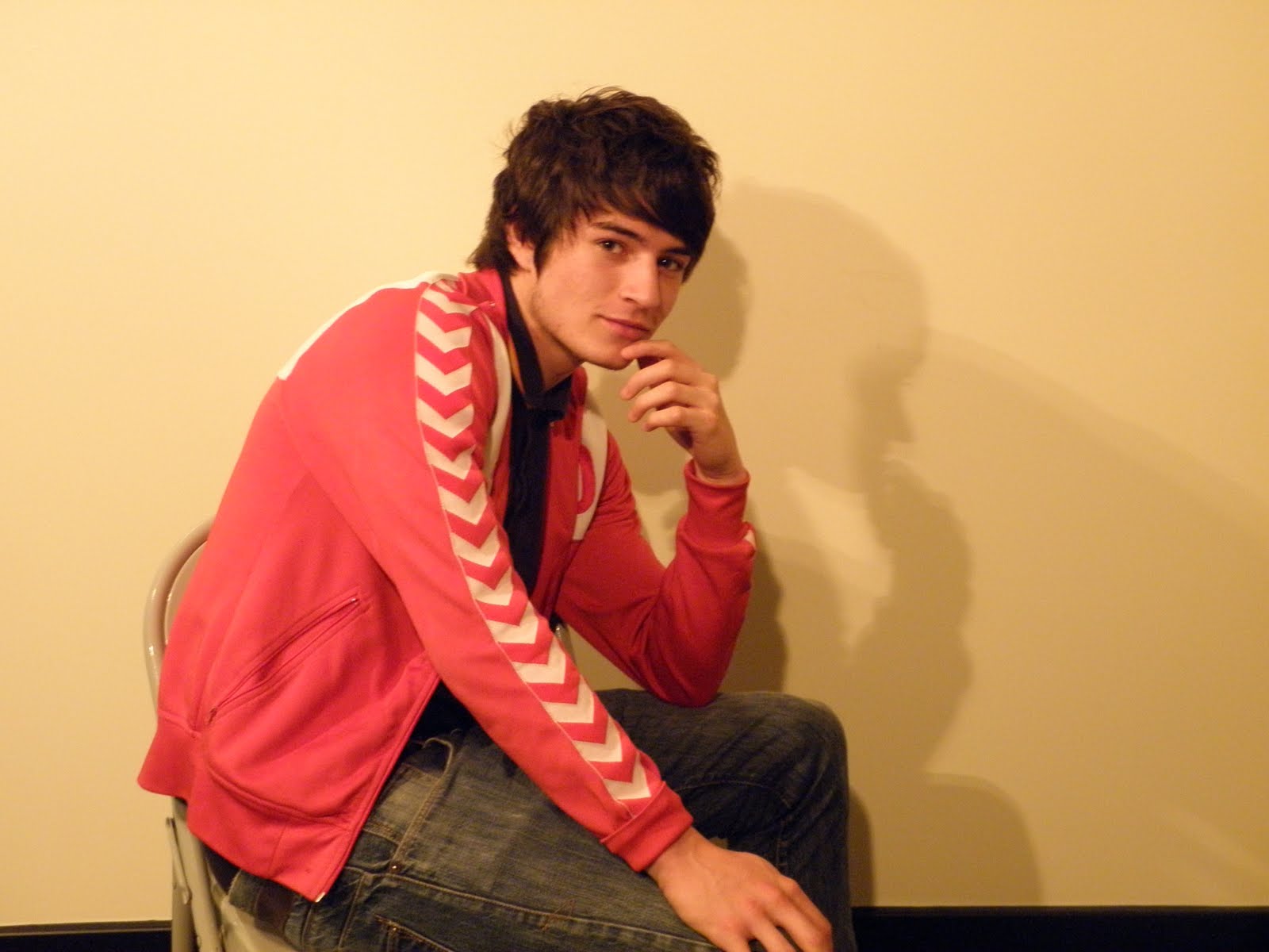
Test shot pictures for Digipak
These are the shots which I have taken for my Digipak. They were supposed to be used as test shots but I am happy with these images and I am going to use them for my actual digipak. I wont use all of the images but I am going to select  the best six.


the best six. 



Thursday, 3 March 2011


Font styles
As I am not quite sure on what I am going to call my artist yet, I will just test font types in the original artists name until I decide what I will name him. The font style I am looking for is a quirky and contemporary style which will make the artist look like more of a unique pop artist. I tested a a few fonts from http://www.dafont.com/ : 


Since deciding the artists name 'Danny T', I have applied his name to different font styles:


Since deciding the artists name 'Danny T', I have applied his name to different font styles:


Wednesday, 2 March 2011
Final Edit, Music video complete!
Today I have completed my music video, and put it onto a DVD! I added the last thirty seconds. I wasn't sure what to put in but I repeated a few shots from the chorus and I added a shot of the couple chasing each other through the woods in slow motion, I put some performance inbetween and then went back to the second part of the shot which I think works well. I also added an end where the artist laughs and throws his hand down as though hes finished and I think its the most effective part of my video! I am really pleased with the finished product.
Tuesday, 1 March 2011
Edit
Today I have been playing around with different backgrounds to use behind Danny singing, I want it to be a really good background because the performance is so good. I played around with using different colours to match each beat which is a convention of music videos. I used red, green, yellow and blue but when I played it back with the music and included it in the rest of the video but it didn't go at all! So I took them off and had a flick through my previous clips at the foreshore. I found a pan of the humber bridge and the sunset I had taken, I played it and the camera movement was really shakey but then I thought of an idea to still frame it. I still framed the background when you can see the stones and pebbles on the floor and there is a sunset in the background. I added the image to one clip and it looked really good! It went well with the rest of the video and it matched with the mood, tone and style of the video. So now that I had a background I applied it to every clip of him singing in the green room and I had a very productive editing session. Hopefully, I will be finished in my next editing session!
Handwritten Plan for Digipak
 This is my plan for my digipak. I am going to use the same theme throughout the whole digipak. I am planning to have the artist doing a number of different poses for each cover. I want the front cover to be the same pose as on the back, but it will taken from the back instead. I want to use black and white or sepia tones to make the digipak look professional and effective. I have also put musical notes on some of the plans as I would like to use some sort of artwork to make it look more interesting. It will be set in front of a white wall.
This design will be used for the inside fold and at the back of the digipak. It will also follow the theme of black and white or sepia tones and some sort of artwork. It will require different poses from the artist.

This is the design for the inside behind the CD and the inside behind the front cover. It will again follow the themes of black and white or sepia tones and some sort of artwork. Also, it will require different poses of the artist.
Subscribe to:
Posts (Atom)